10 Tips For New Graphic Designers!
It is always very easy to forget the fundamentals of graphic design when there is so much to learn and start with. There is always a scope of new learning and mistakes that you almost forget to introspect about this one simple question “Does this design look right?”.
Graphic design is a blend of technology and creativity in the design industry. One of the responsibilities of graphics design job is to develop advertising communication, brochure, and other advertising materials concepts. Many people work on books, logos, websites, typography, packaging designs, and other projects.
Top 10 tips for beginner graphic designers:
We have penned down 10 essential graphic designing tips and tricks for budding graphic designers. Make sure you apply them in your upcoming projects, whether personal or professional.
Tip #1: Say no to “Mixing of too many fonts.”
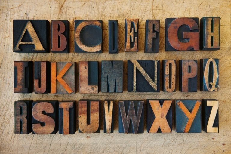
This may be is one of the biggest sins in the world of the graphic design. Adding too many font types in one piece would make it look chaotic and unprofessional.
For simple and effective graphic design, use easy-to-read fonts when choosing a typeface or font for headings, subtitles, and body text. Because the eye struggles to scan multiple typefaces, stick to a small collection of fonts.
As a thumb rule, you should not add more than three fonts in one design. Some designers like to contrast fonts like Serif and San Serif to make the design look calm and soothing to the eyes.
However, there are few exceptions to this thumb rule. There are projects where you are expected to use different fonts for each line, but that depends on the project. Always remember that the success of any design would depend on the selection of fonts and simplicity.
Tip #2: Be very specific with kerning
Kerning is the separation of individual letters or characters. In other words, kerning is nothing but the spacing between characters and letters in any given text. There will be times that you are too wrapped up with your design that you might forget to check whether the text is decipherable manually. And such tiny mistakes can cost you a lot. Always ensure that the alignment of the text is proper and readable.
Unlike tracking, which adjusts the amount of space between the letters of an entire word in equal increments, kerning is concerned with how type appears — creating readable, visually appealing text.
Tip #3: Be extra careful while choosing colors
We cannot stress enough the importance of colour schemes in your designs. Your sincere efforts in design can very quickly fail by not getting the colours right.
Color palettes and colour schemes are just as important as the message you want your design to convey. Choosing the ideal colour combination, on the other hand, is not always simple.
Try to learn more about primary, secondary, tertiary, complementary, and contrasting colours. You might take a little time to understand the colour scheme, but slowly and steadily, you will get a hack of it.
Tip #4: Say no to side borders
This idea may not sound appealing to ones who have been in this game for long. You can add borders to your piece to try and give it a cohesive look. But adding these borders can also backfire by giving a very amateur look. The only alternative for this problem is that you can add blank space or allow the image to bleed through the edges seamlessly.
Tip #5: Get inspired rather than plagiarism
When you start designing, nobody expects you to have your signature style straight off the bat. That precision will come only will time and knowledge. It’s ok to get inspired with everything you see for expertise and experience. There is always a fragile line between plagiarism and inspiration which many designers often dispute over. Always remember to establish your own instill idea to create your niche.
Tip #6: Importance of blank spaces
In graphic design, the utilization of white space may be problematic. This method has lately become popular. Apple, one of the most well-known businesses globally, is an big fan of minimalist design. Designers should consider white areas to be their most valuable asset. Use monochrome colours and a high-quality typeface. Black is a typical pick since it contrasts nicely with white.
In graphic design, there are two types of white spaces: micro and macro. Micro white space is the paragraphs, letters & lines whereas Macro white space is the distance between the major elements. Micro white space maintains the aesthetic of the design & macro makes it easy for the viewer to understand the design flow correctly.
Tip #7: Sketch your design
In your newly started graphics designing job, you may want to take the simple route and just search for ideas on Google, which you can then alter and enhance. Often a graphic designer underestimates the value of a good drawing and how it can enhance a design. Sketching is a terrific technique to give your graphic design a personal and distinct touch. After you have finished drawing on a sheet of paper, scan it and modify it in Illustrator or Photoshop. Sketching may help you take your idea to new heights.
Sketching helps the designer discard prominent concepts and go further into the creative process, resulting in a unique and inventive work of art. Sketching your design may help you gain a better knowledge of all the components of your graphic design. This gives your design a new lease ofn life, and you will feel more at ease with your personalized and unique style.
Tip #8: Understand the magic of Balance
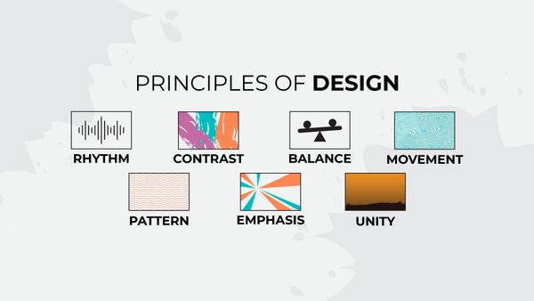
Symmetry and balance are crucial in graphic design. The design should be perfectly balanced from all viewing angles. Symmetry is created using the mirror images and repetition to create balanced designs whereas Balance is a visual effect that makes designs look as if they are equally weighted on both sides of their vertical center.
Tip #9: Try to incorporate Italics
Use italic fonts to add a finishing touch to your design. This might be difficult since you want to utilize Italics sparingly to get the correct balance in your artwork. Italic typefaces are employed in brief sentences to balance the headings and sub headers. In your new design, you might want to enhance and upscale your current skills.
Tip #10: Use of consistent images
When creating a website theme or a series of artworks, this idea is used. Your design must act in coordination to produce a coherent image of the brand’s character or the message you intended to send. This gives your endeavor a greater sense of significance. Everything in your design should work together to create a cohesive whole.
This trend is growing in popularity and is an efficient technique to communicate a brand message. The key to business growth is consistency. It might take time for designers to find their aesthetic identity on social media if you have recently started your graphics design journey. Nevertheless, your design will stand out if you follow a style guide and stick to a constant theme.
Trust the design process, make your own rules!
To sum up, those are our 10 tips for graphic designers! It is always advisable to take professional help to become one of the finest graphic designers; Initially, it can be daunting and can look like a struggle. Keep pushing and learning through this phase with easy graphic design courses & you will be well on your way to become a phenomenal designer.
Remember to be creative, break the rules, and challenge your design abilities by coming up with new and innovative ideas. At the end of the day, graphic design is all about experimentation and exploration.

